Stock Correlation Web App
Interactive Streamlit application that computes and visualizes correlation matrices between financial assets using Yahoo Finance data.
The story
Every finance student eventually builds the same first tool, and this is mine. I wanted to see which assets move together and which drift apart, so I made a small app that takes a handful of ticker symbols, pulls their price history, and paints the relationships as a heatmap.
The honest motivation was diversification, the comforting idea that if you own things that do not move in sync, you are a little safer. The app is very good at showing you those tidy, low-correlation pairs in calm weather. It is also a quiet lesson in humility, because anyone who has watched a real crash knows that the moment things go wrong, every asset on the board suddenly discovers it is best friends with every other one.
The technical confession is that I got to skip the part of web development I like least. Streamlit let me turn a Python script into a usable app without writing a single line of the HTML and CSS I would otherwise have fought for a week. I typed some Python, it produced buttons, and I chose not to ask too many questions.
Features
- Dynamic ticker input (any Yahoo Finance symbol)
- User-defined time range for analysis
- Automatic data retrieval from Yahoo Finance
- Correlation matrix generation
- Heatmap visualization for intuitive interpretation
Methodology
The application retrieves historical stock data using the yfinance API.
Closing prices are extracted and used to compute a Pearson correlation matrix between all selected assets.
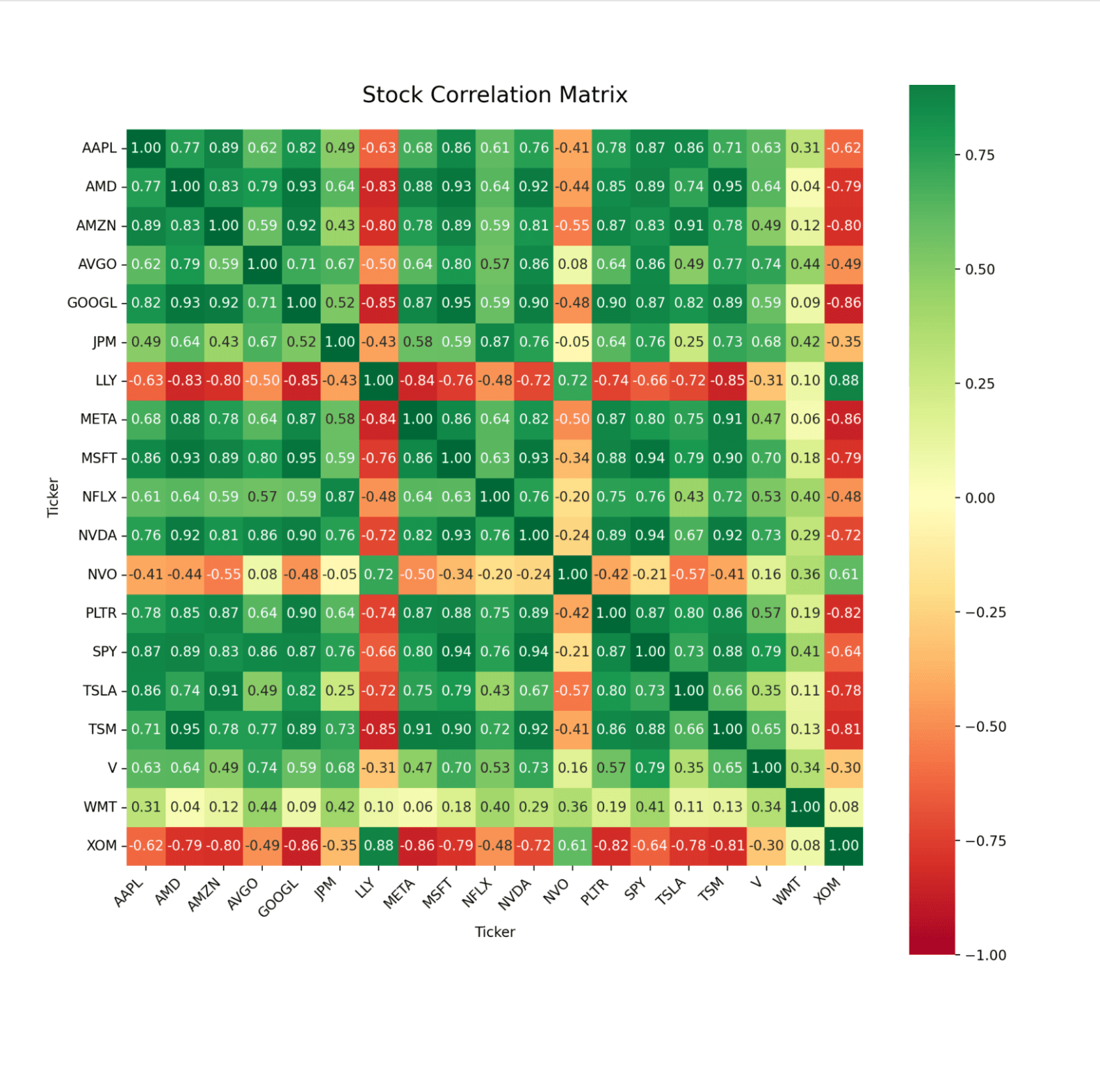
The resulting matrix is cleaned, rounded for readability, and visualized using a Seaborn heatmap, which highlights both positive and negative relationships between assets.
Interface
The app is built with Streamlit, allowing users to interactively:
- Enter a list of ticker symbols
- Select a start and end date
- Generate a correlation matrix instantly
Results are displayed as both a numerical dataframe and a visual heatmap, making it easier to identify clusters of correlated assets.
Live app
Streamlit app — correlation matrix from historical price data.
Screenshots
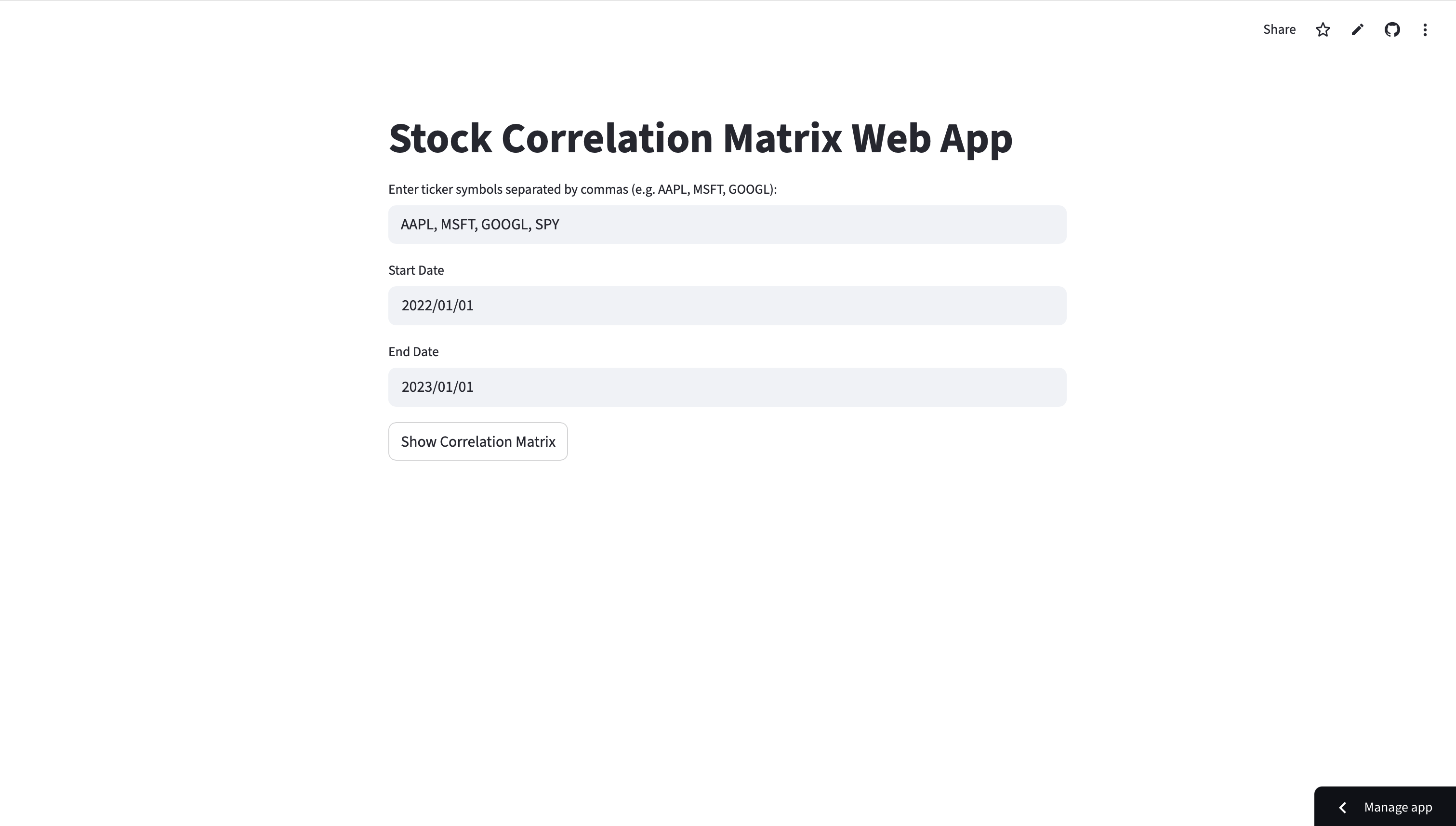
Start page: ticker input and date range selection.
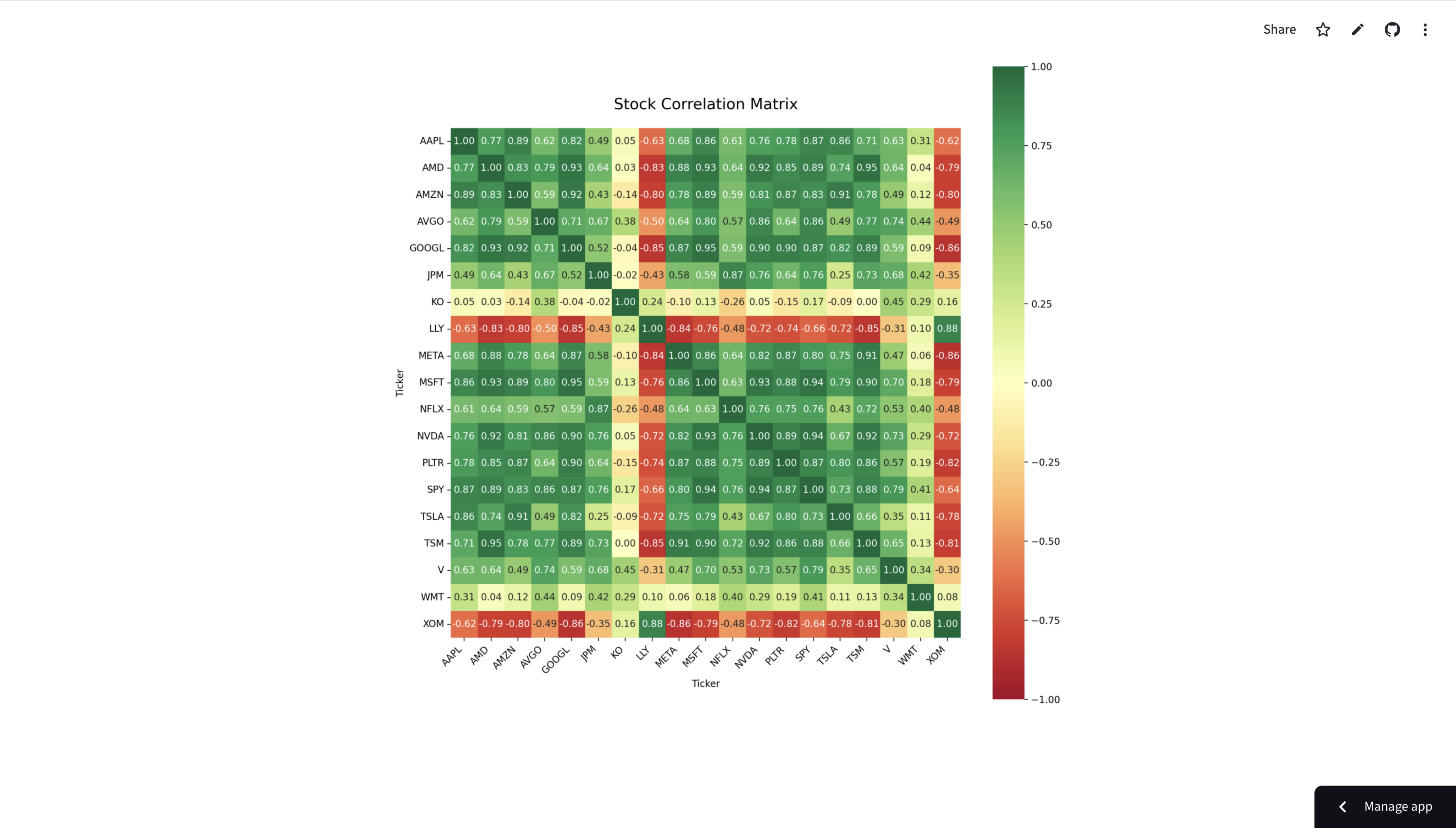
Result: correlation matrix visualization for selected tickers.
Key Takeaways
- Correlation analysis is a simple but powerful tool for portfolio diversification.
- Visual heatmaps make financial relationships easier to interpret.
- Streamlit enables rapid prototyping of data applications with minimal frontend work.